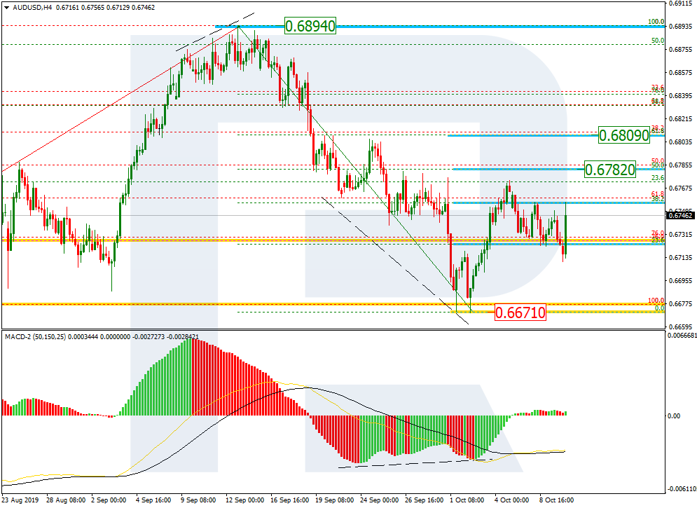
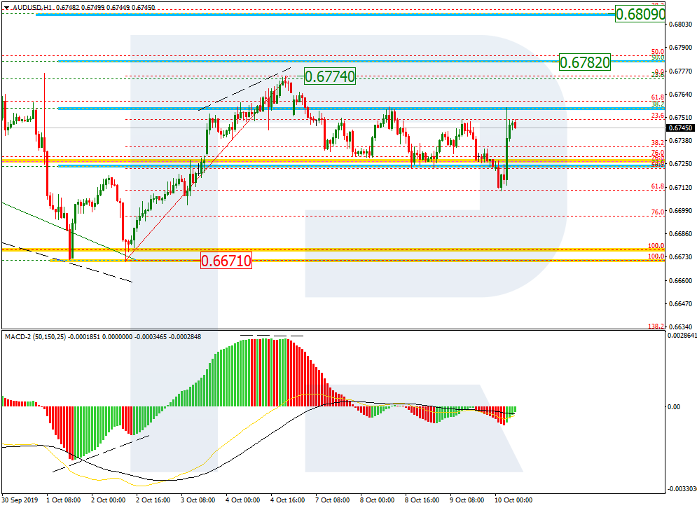
As we can see in the H4 chart, after finishing the correctional wave, AUDUSD is forming a new rising impulse. In the future, the impulse may reach 50.0% and 61.8% fibo at 0.6782 and 0.6809 respectively. After completing the pullback and breaking the low at 0.6671, the price may continue falling towards the post-correctional extension area between 138.2% and 161.8% fibo at 0.6595 and 0.6543 respectively.
In the H1 chart, has completed the correctional decline at 61.8% fibo. The current growth is heading to break the high at 0.6774.
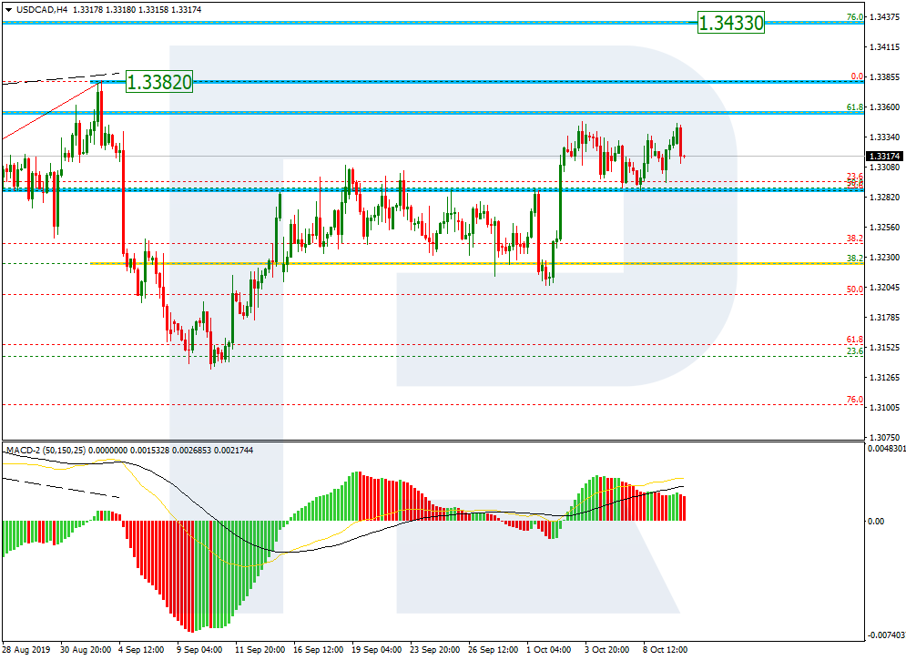
USDCAD, “US Dollar vs Canadian Dollar”
As we can see in the H4 chart, USDCAD is forming a mid-term rising tendency towards the high at 1.3382. After breaking it, the price may continue the ascending tendency towards the mid-term target, which is 76.0% fibo at 1.3433. The support is 38.2% fibo.
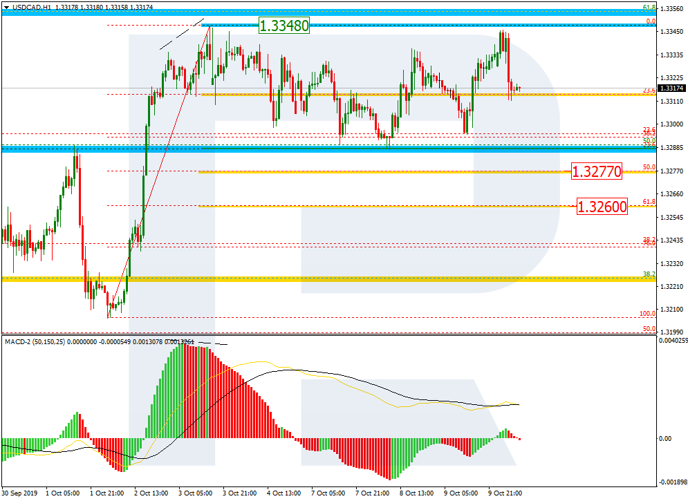
In the H1 chart, the pair continues moving sideways and has already reached 38.2% fibo. In the future, the decline may continue towards 50.0% and 61.8% fibo at 1.3277 and 1.3260 respectively. After breaking the resistance at 1.3348, the price may continue growing.
As we can see in the H4 chart, after finishing the short-term correction and updating the local low, GBPUSD has reached 61.8% fibo. The next downside target is 76.0% fibo at 1.2108. If the pair is able to break this level, it may try to test the low at 1.1958 and once again enter the post-correctional extension area between 138.2% and 161.8% fibo at 1.2019 and 1.1788 respectively.
In the H1 chart, the pair is testing 61.8% fibo. Later, the price is expected to fall towards 76.0% fibo at 1.2108.
EURJPY, “Euro vs. Japanese Yen”
As we can see in the H4 chart, the convergence made EURJPY complete the descending wave at 61.8% fibo. The current situation may be considered as the start of another mid-term rising wave. However, one shouldn’t exclude a possibility of further decline towards 76.0% fibo at 116.86 in the short-term, but the main scenario implies that the price is expected to move upwards. The first rising impulse has already reached 23.6% fibo. After a slight pullback, the impulse may continue towards 38.2%, 50.0%, 61.8%, and 76.0% fibo at 118.19, 118.54, 118.89, and 119.30 respectively. The key target is the high at 120.01.
In the H1 chart, the price is falling to reach 23.6% fibo. After breaking the local low at 117.07, the mid-term descending tendency may continue towards 76.0% fibo at 116.86.
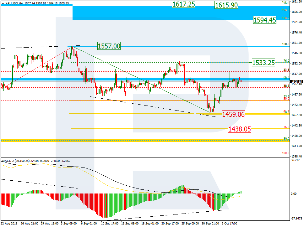
As we can see in the H4 chart, the convergence made the pair complete the descending correction at 61.8% fibo and start a new growth, which has already reached 61.8% fibo. The next upside targets may be 76.0% fibo at 1533.25 and the high at 1557.00. If XAUUSD breaks the high, the instrument may continue growing towards the post-correctional extension area between 138.2% and 161.8% fibo at 1594.45 and 1617.25 respectively.
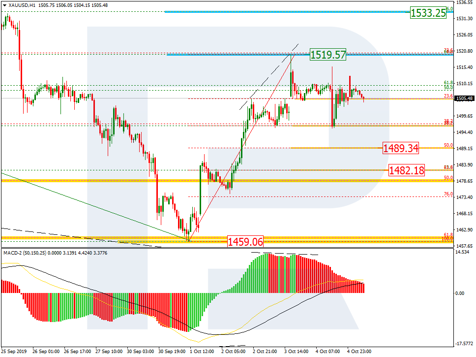
In the H1 chart, we can see a short-term pullback, which has already reached 38.2% fibo and may yet continue towards 50.0% and 61.8% fibo at 1489.34 and 1482.18 respectively. The resistance is the high at 1519.57.
USDCHF, “US Dollar vs Swiss Franc”
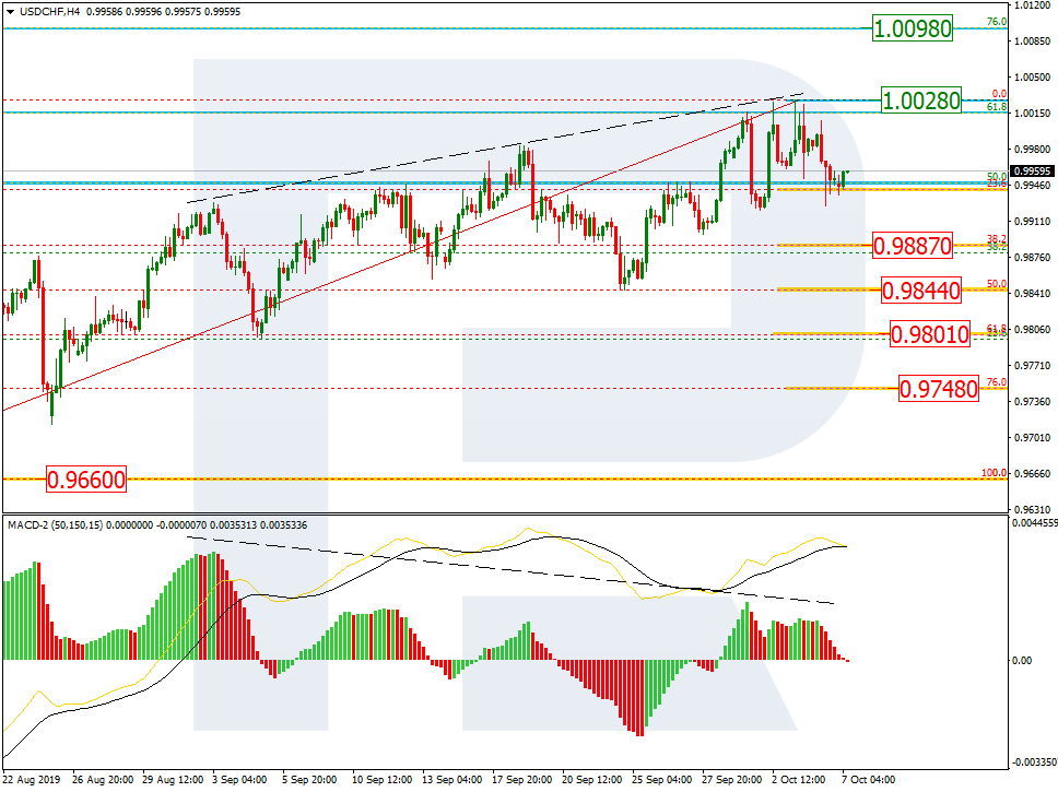
As we can see in the H4 chart, the divergence made the pair finish the ascending tendency at 61.8% fibo. However, if the price breaks the high at 1.0028, the tendency may yet continue to reach 76.0% fibo at 1.0098. Still, the divergence indicates a new decline in the first place, which has already reached 23.6% fibo. The next downside targets may be 38.2%, 50.0%, 61.8%, and 76.0% fibo at 0.9887, 0.9844, 0.9801, and 0.9748 respectively.
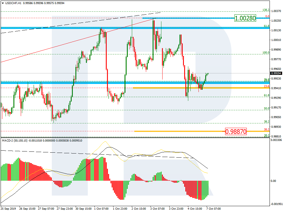
In the H1 chart, after completing the descending impulse, the pair is still testing 23.6% fibo. The next downside target is 38.2% fibo at 0.9887.
The Evening Star candlestick is a three-candle pattern that signals a reversal in the market and is commonly used to trade forex. Correctly spotting reversals is crucial when trading financial markets because it allows traders to enter at attractive levels at the very start of a possible trend reversal.
This article explores the following talking points:
What is an Evening Star candlestick?
How to Identify an Evening Star on forex charts
How to trade the Evening Star candlestick pattern
The reliability of the Evening Star in forex trading
WHAT IS AN EVENING STAR CANDLESTICK?
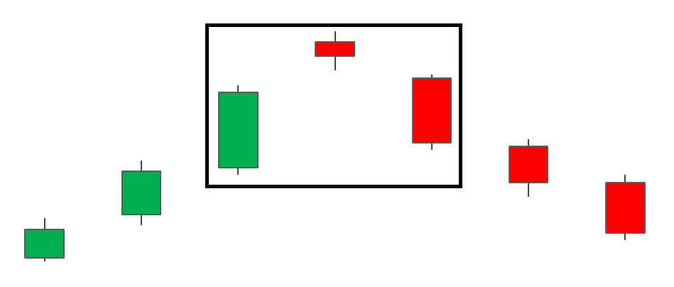
The Evening Star pattern is a three-candle, bearish reversal candlestick pattern that appears at the top of an uptrend. It signals the slowing down of upward momentum before a bearish move lays the foundation for a new downtrend.
HOW TO IDENTIFY AN EVENING STAR ON FOREX CHARTS
Identifying the Evening Star on forex charts involves more than simply identifying the three main candles. What is required, is an understanding of previous price action and where the pattern appears within the existing trend.
Establish an existing uptrend: The market should be exhibiting higher highs and higher lows.
Large bullish candle: The large bullish candle is the result of large buying pressure and a continuation of the existing uptrend. At this point traders should only be looking for long trades as there is no evidence of a reversal yet.
Small bearish/bullish candle: The second candle is a small candle – sometimes a Doji candle – that presents the first sign of a fatigued uptrend. Often this candle gaps higher as it makes a higher high. It does not matter if the candle is bearish or bullish as the main takeaway here is that the market is somewhat undecided.
Large bearish candle: The first real sign of new selling pressure is revealed in this candle. In non-forex markets, this candle gaps down from the close of the previous candle and signals the start of a new downtrend.
Subsequent price action: After a successful reversal, traders will observe lower highs and lower lows but should always manage the risk of a failed move through the use of well-placed stops.
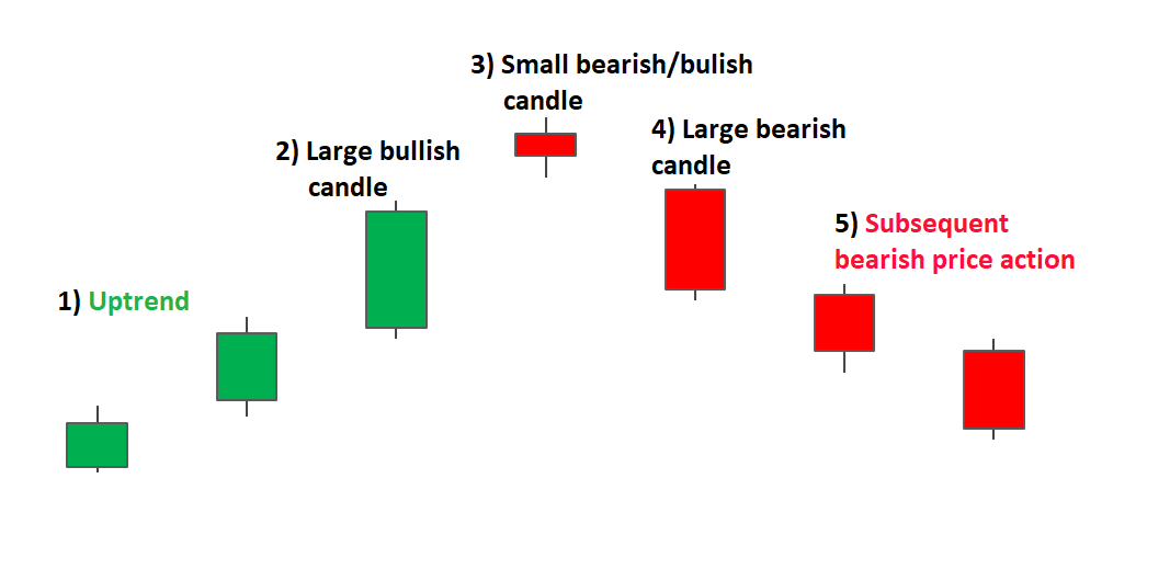
Traders will often look for signs of indecision in the market where buying pressure subsides and leaves the market somewhat flat. This is the ideal place for a Doji candle to appear.
Evening Star Doji
Doji candles can be observed as the market opens and closes at the same level or very close to the same level. This indecision paves the way for a bearish move as bears see value at this level and prevent further buying. The appearance of the bearish candle after the Doji provides this bearish confirmation.
WHAT ABOUT THE MORNING STAR
The bullish version of the Evening Star is the Morning Star and it signifies a potential turning point in a falling market (bullish reversal pattern). The same analysis applied to the Evening Star can be implemented with the Morning Star however, it will be the opposite direction.
HOW TO TRADE THE EVENING STAR CANDLESTICK PATTERN
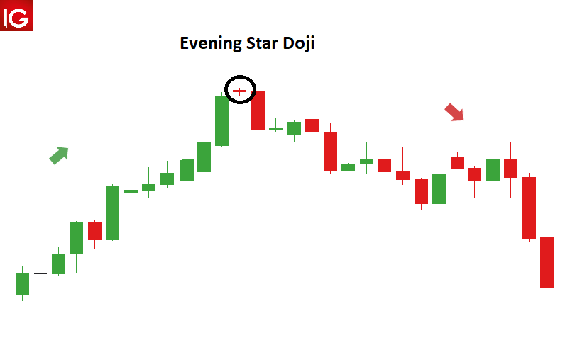
The Evening Star pattern can be observed in the EUR/GBP chart below, where there is an established uptrend leading up to the formation of the reversal pattern.
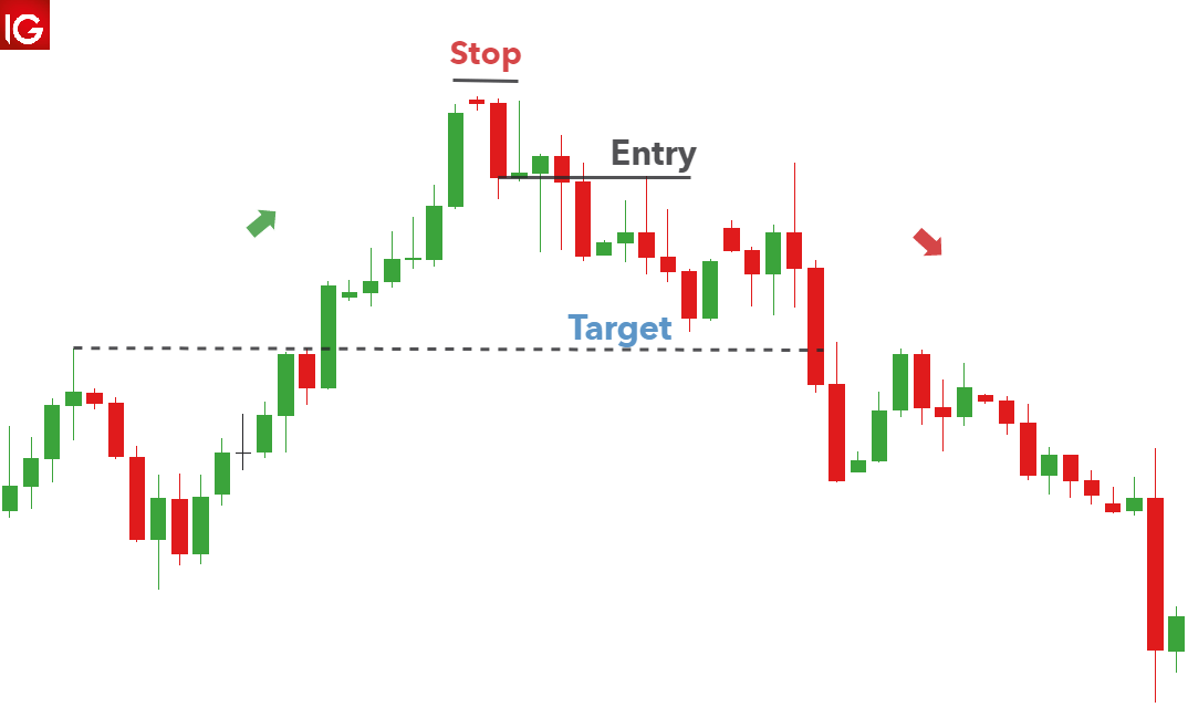
Looking at the chart, once the formation has completed, traders can look to enter at the open of the very next candle. More conservative traders could delay their entry and wait to see if price action moves lower. However, the drawback of this is that the trader could enter at a much worse level, especially in fast moving markets.
Targets can be placed at previous levels of support or previous area of consolidation. Stops can be placed above the recent swing high, as a break of this level would invalidate the reversal. Since there are no guarantees in the forex market, traders should always adopt soundrisk management while maintaining a positive risk to reward ratio.
When trading the Evening Star on forex markets, the price will very rarely gap like they do with stocks and so the three-candle pattern usually opens very close to the previous closing level.
HOW RELIABLE IS THE EVENING STAR IN FOREX TRADING?
The Evening Star, like most candlestick patterns, should be assessed in line with the current trend and whether there is supporting evidence in favour of the trade, when looking at an indicator. Below are the advantages and limitations of the Evening Star pattern:
ADVANTAGES
LIMITATIONS
Occurs frequently in the forex market
A failed reversal is possible, and price could move further up
The pattern presents well-defined entry and exit levels
Candlestick charts differ greatly from the traditional bar chart
Traders generally prefer using candlestick charts for day-trading because they offer an enjoyable visual perception of price
It’s important to understand the key components of a candle, and what they indicate, to apply candlestick chart analysis to a trading strategy
WHAT IS A CANDLESTICK CHART?
A candlestick chart is simply a chart composed of individual candles, which traders use to understand price action. Candlestick price action involves pinpointing where the price opened for a period, where the price closed for a period, as well as the price highs and lows for a specific period.
Price action can give traders of all financial markets clues to trend and reversals. For example, groups of candlesticks can form patterns which occur throughout forex charts that could indicate reversals or continuation of trends. Candlesticks can also form individual formations which could indicate buy or sell entries in the market.
The period that each candle depicts depends on the time-frame chosen by the trader. A popular time-frame is the daily time-frame, so the candle will depict the open, close, and high and low for the day. The different components of a candle can help you forecast where the price might go, for instance if a candle closes far below its open it may indicate further price declines.
INTERPRETING A CANDLE ON A CANDLESTICK CHART
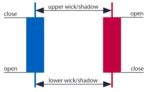
The image below represents the design of a typical candlestick. There are three specific points (open, close, wicks) used in the creation of a price candle. The first points to consider are the candles’ open and close prices. These points identify where the price of an asset begins and concludes for a selected period and will construct the body of a candle. Each candle depicts the price movement for a certain period that you choose when you look at the chart. If you are looking at a daily chart each individual candle will display the open, close, upper and lower wick of that day.
Open price:
The open price depicts the first price traded during the formation of the new candle. If the price starts to trend upwards the candle will turn green/blue (colors vary depending on chart settings). If the price declines the candle will turn red.
High Price:
The top of the upper wick/shadow indicates the highest price traded during the period. If there is no upper wick/shadow it means that the open price or the close price was the highest price traded.
Low Price:
The lowest price traded is the either the price at the bottom of the lower wick/shadow and if there is no lower wick/shadow then the lowest price traded is the same as the close price or open price in a bullish candle.
Close Price:
The close price is the last price traded during the period of the candle formation. If the close price is below the open price the candle will turn red as a default in most charting packages. If the close price is above the open price the candle will be green/blue (also depends on the chart settings).
The Wick:
The next important element of a candlestick is the wick, which is also referred to as a ‘shadow’. These points are vital as they show the extremes in price for a specific charting period. The wicks are quickly identifiable as they are visually thinner than the body of the candlestick. This is where the strength of candlesticks becomes apparent. Candlesticks can help traders keep our eye on market momentum and away from the static of price extremes.
Direction:
The direction of the price is indicated by the color of the candlestick. If the price of the candle is closing above the opening price of the candle, then the price is moving upwards and the candle would be green (the color of the candle depends on the chart settings). If the candle is red, then the price closed below the open.
Range:
The difference between the highest and lowest price of a candle is its range. You can calculate this by taking the price at the top of the upper wick and subtracting it from the price at the bottom of the lower wick. (Range = highest point – lowest point).
Having this knowledge of a candle, and what the points indicate, means traders using a candlestick chart have a clear advantage when it comes to distinguishing trendlines, price patterns and Elliot waves.
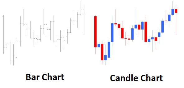
Bar Chart vs Candlestick Chart
As you can see from the image below, candlestick charts offer a distinct advantage over bar charts. Bar charts are not as visual as candle charts and nor are the candle formations or price patterns. Also, the bars on the bar chart make it difficult to visualize which direction the price moved.
HOW TO READ A CANDLESTICK CHART
There are various ways to use and read a candlestick chart. Candlestick chart analysis depends on your preferred trading strategy and time-frame. Some strategies attempt to take advantage of candle formations while others attempt to recognize price patterns.
Interpreting single candle formations
Individual candlesticks can offer a lot of insight into current market sentiment. Candlesticks like the Hammer, shooting star, andhanging man, offer clues as to changing momentum and potentially where the market prices maytrend.
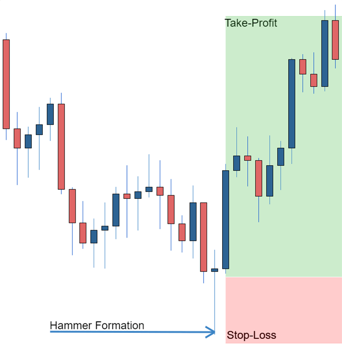
As you can see from the image below the Hammer candlestick formation sometimes indicates a reversal in trend. The hammer candle formation has a long lower wick with a small body. Its closing pricing is above its opening price. The intuition behind the hammer formation is simple, price tried to decline but buyers entered the market pushing the price up. It is a bullish signal to enter the market, tighten stop-losses or close out a short position.
Traders can take advantage of hammer formations by executing a long trade once the hammer candle has closed. Hammer candles are advantageous because traders can implement ‘tight’ stop-losses (stop-losses that risk a small amount of pips). Take-profits should be placed in such a way as to ensure a positive risk-reward ratio. So, the take-profit is larger than the stop-loss.
Recognizing price patterns in multiple candles
Candlestick charts help traders recognize price patterns that occur in the charts. By recognizing these price patterns, like the bullish engulfing pattern or triangle patterns you can take advantage of them by using them as entries into or exit signals out the market.
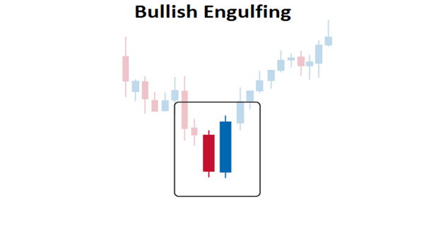
For example, in the image below we have the bullish engulfing price pattern. The bullish engulfing is a combination of a red candle and a blue candle that ‘engulfs’ the entire red candle. It is an indication that it could be the end of a currency pairs established weakness. A trader would take advantage of this by entering a long position after the blue candle closes. Remember, the price pattern only forms once the second candle closes.
As with the hammer formation, a trader would place a stop loss below the bullish engulfing pattern, ensuring a tight stop loss. The trader would then set a take-profit. For more forex candlestick charts check our forex candlesticks guide where we go in depth into the advantages of candlestick charts as well as the strategies that can be implemented using them.
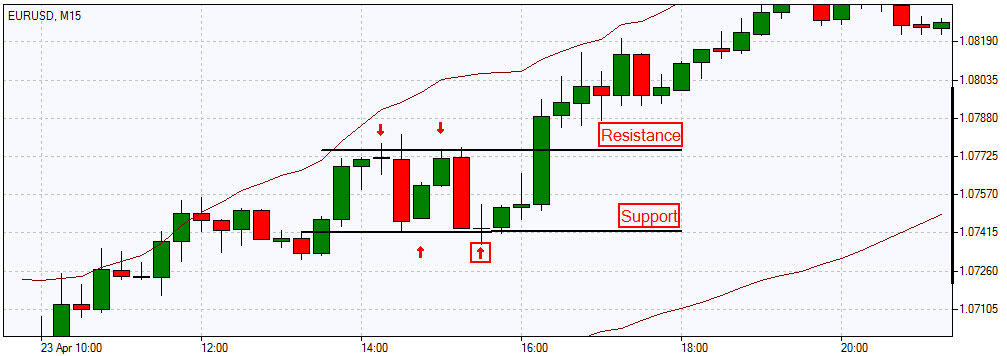
In order to completely understand the essence of support and resistance trading strategy you should firstly know what a horizontal level is. Actually, it is a price level indicating either a support or resistance in the market. The support and resistance in technical analysis are the terms for price lows and highs respectively. The term support indicates the area on the chart where the buying interest is significantly strong and surpasses the selling pressure. It is usually marked by previous troughs. Resistance level, contrary to the support level, represents an area on the chart where selling interest overcomes buying pressure. It is usually marked by previous peaks.
In order to develop a support and resistance strategy you should be well aware of how the trend is identified through these horizontal levels. Thus, for an uptrend to go on, each successive support level should be higher than the previous one, and each successive resistance level should be higher than the one preceding it.
In case this is not so, for instance, if the support level comes down to the previous trough, it may signify that the uptrend is coming to the end or at least it is turning into a sideways trend. It is likely that trend reversal from up to down will occur. The opposite situation takes place in a downtrend; the failure of each support level to move lower than the previous trough may again signal changes in the existing trend.
The concept behind support and resistance trading is still the same – buying a security when we expect it to increase in price and sell when expecting its price to go down. Thus, when the price falls to the support level, traders decide to buy creating demand and driving the price up. In the same way, when the price rises to a resistance level, traders decide to sell, creating a downward pressure and driving the price down.
Forex trading is all about eliminating the losing trades and achieving more winning ones.
This is largely achieved thanks to proven Forex trading strategies. Using these strategies, a trader develops for himself a set of rules that help to take advantage of Forex trading.
Quite often, traders will rely on trading strategies that haven’t been tested thoroughly, setting themselves up for a failure. The truth is, you can spend hours searching all over the internet for the right strategy – and have no luck finding one.
The only solution is to try out the leading strategies for yourself and see what actually works.
Forex trade strategies and goals
Before discussing trading setups and possible strategies, we need to first understand why one would consider trading Forex in the first place. There are two main reasons: hedging and speculation.
Hedging refers to companies protecting themselves from losses. They get their daily profits from any overseas country (that has paid revenue in a foreign currency). Then, they transfer it back to their own country, expecting fluctuation in the currency.
This practice isn’t really relevant to Forex strategies.
On the other hand, speculation refers to predicting a move that a company might make in a certain situation. If done correctly, these predictions greatly improve trading results.
Speculation is what day trading is all about. With the help of decent strategies, you can progress in the Forex trading world and ultimately develop your own trading strategy. The downside is that this is a time-consuming and difficult process.
The good news is that there are pre-made strategies available for you to try.
Although it is better to play it safe, especially if you’re new to the game, you need to change your tactics from time to time. This may allow you to see a profit margin you could have missed otherwise.
What is the best Forex trading strategy?
Here we have a few methods that will help you quickly change tactics and gain pips.
We’re going to provide you with an overview of strategies that have worked for many years, so that you can research the ones that are of interest to you. These are the Forex trading strategies that work, and they have been proven to work by many traders.
The Bladerunner Trade
This is suitable for all timeframes and currency pairings. It is, at this moment, one of the trending strategies in the market. The Bladerunner Trade is a price action strategy.
Daily Fibonacci Pivot Trade
This trade uses daily pivots only. However, it can be extended to a longer timeline. It combines Fibonacci retracements and extensions. Fibonacci trade can incorporate any number of pivots.
Bolly Band Bounce Trade
This strategy is perfect for a ranging market. If you use it in combination with confirming signals, it works really well. If you are interested in Bollinger Bands strategy, this one is definitely worth checking out.
Forex Overlapping Fibonacci Trade
These strategies are a favourite among many traders. The reliability tends to be a bit lower, but used in combination with appropriate confirming signals, they become extremely accurate.
The Pop ‘n’ Stop Trade
Trying to chase the price when it goes upside rarely works. That is, unless you know this trick. This Forex trading strategy gives you a simple tip so you know whether the price will continue to rise or decrease.
Trading the Forex Fractal
This is more of a concept rather than a strategy, but you need to know this if you want to understand what the prices are doing. This offer you a lesson in market fundamentals, which will really help you to trade more effectively.
Currency trading strategies are a game of trial and error. It may be worth trying out the strategies from list above to see if any work for you. However, we will look at two further strategies which tend to be more common than the ones previously mentioned.
What’s more, they have been consistently proven to work.
Scalping in a nutshell
Many consider scalping to be tiresome and time-consuming. Indeed, not every trader can successfully pull it off. It may really seem that scalping takes the fun out of the best Forex strategy.
On the other hand, it really does work.
If you are on the lookout for a reliable Forex strategy, this might be your safest choice. As a day trader, you will dip in and out of the market once or twice a day and always carry a position into another period. Ideally, the profit will come back.
If you’re a savvy scalper, this process is usually far more frenetic. You will trade in and out of the Forex markets several times per day. The profit margins may appear small but they’re also steady.
The more you scalp, the more you will make.
For example, if you trade EUR/USD pair and the price of either currency jumped up 20 pips, you get a slight profit for taking an action.
The result is a tiny profit, but that is a profit made in a single minute. The amount and consistency of your overall profits depend on your commitment and reflexes.
If scalpers want to truly take advantage of the news releases, they should wait for the most important ones. When you scalp, you need to remember when GDP, unemployment figures and inflation rates are about to be released.
These factors affect trading strategies, particularly in the currency trading market, where scalping can be most profitable.
While scalping can certainly teach you to trade the currency market, it takes a lot of time and effort. When you scalp, you have to sit in front of the computer for long periods of time.
Positional trading is an interesting way to trade Forex online. While it can take you only a few hours a week, it can provide you with quite extensive profits.
So how does positional trading work?
Positional trading is all about having your positions opened for a long period of time, so you can catch some large market moves. The rule of thumb is to avoid using high leverage and keep a close eye on the currency swaps.
Sometimes these swaps can cost you more than your actual profit.
With positional trading, you can learn not only Forex trading strategies but also the skills you need to become successful. It is a good method of achieving high profits, but it can also put your emotions to test.
Traders may feel the stress from having their funds affected by short term moves. Quite often, traders will have to fight the urge to close their trade when it’s losing points.
With positional trading, you have to dedicate your time to analysing the market and predicting potential market moves. However, there is almost no time spent on the execution of your trading strategy.
Simply start by picking up the pair you know the most about. Calculate the possible volume of your transaction, see what the swap is and how you can break even, analyse the best moment to enter the trade.