rfxsignals April 7, 2020 No Comments

Inside Bar Forex Trading Strategy

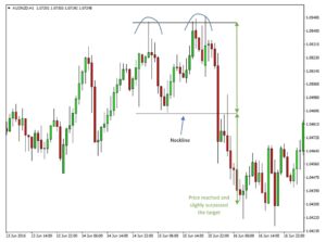
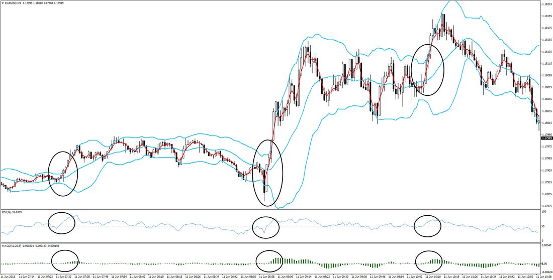
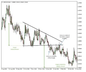
There are hundreds or even thousands of different strategies, systems or techniques that you can use when trading forex or any other market.

To become successful in trading the forex market, a good knowledge of candlestick patterns is useful as Price Action patterns are usually considered to be the most effective and accurate signals of the technical analysis.

​Now we will examine the inside bar forex trading strategy.

Forex Candlestick Chart

What is Inside Bar?

Inside Bar is a candlestick pattern signaling low volatility period in a market. It means that there are not many orders coming to the market and that bulls as well as bears stay calm, and waiting for further market development.

It is very easy to spot the Inside Bar pattern in your charts. It is simply a candle where:

  • The high of the Inside Bar pattern is lower than the high of the previous candle.
  • And the low of the Inside Bar pattern is higher than the low of  the previous candle.

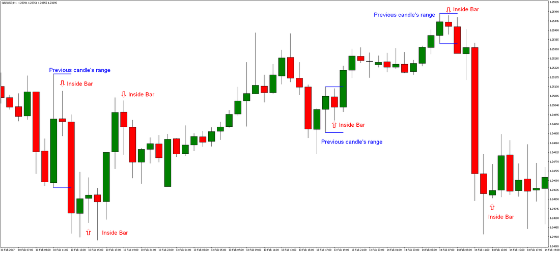
So the Inside Bar candle is simply located inside the range of the previous candle. In the picture below, you can see a few highlighted Inside Bars.

Forex Inside Bar Trading

Inside Bar Forex Trading Strategy

What does the Inside Bar indicate?

As already mentioned, an inside bar usually indicates following:

  • Consolidation: The market is taking a breather before moving on in the direction indicated by the breakout direction of the Inside Bar pattern.
  • Indecision: The market does not make new highs or lows because market participants are unsure of the direction of further development.

How to trade using the Inside Bar Pattern?

As you maybe noticed when taking a look at the chart above, Inside Bars can also form other candlestick patterns in the same time.

When aiming entirely on trading Inside Bars, an entry signal is generated as soon as a price breaks through a high or low of an Inside Bar pattern. The direction of the breakout determines the direction of the trade that should be opened. If a price breaks through the high of an Inside Bar, bullish signal is generated, and vice versa. It also means that Inside Bars can be traded by placing the stop pending orders.

Stop-Loss should be always placed on the other side of the candle. In case of the bullish breakout, the long order should be opened above the high of the Inside Bar, and the Stop-Loss should be placed below the low of the Inside Bar. Vice versa applies for bearish breakouts. You can see a few examples of trading Inside Bars below. The advantage here is that Inside Bars require small Stop-Loss only due to a low volatility period.

Picture

Inside Bar Forex Trading Strategy

If you are trying to trade the Inside Bars, but your orders are stopped out too soon, you can also consider using the supports and resistances for placing Stop-Losses. Supports and resistances can be very effectively used for placing Profit-Targets as well.

Regarding the body of Inside Bars, it usually does not matter that much if it is bullish, bearish or neutral. However, if the breakout of an Inside Bar happens in the same direction as the direction of Inside Bar’s body (like bullish breakout of the Inside Bar with bullish body), it can add some little extra points.

Inside Bar Trading System

It is important to say that neither Inside Bars are a surefire trading signal of technical analysis. However, by trading Inside Bars in a direction of the main trend or using Inside Bars in a conjunction with supports and resistances, you can significantly increase the probability of successful Inside Bar signals, and filter out fake breakouts in the same time.

In the chart below, you can see that there was the well-established bullish trend (highlighted by the red rising channel). The channel here acted like a rising S/R zone.

Forex Trading Inside Bar System

Inside Bar Forex Trading Strategy

As you can see in the chart above, all Inside Bars bouncing near the red rising channel were profitable – considering that we are taking the bullish breakouts here only.

Okay, so now you already know that in case of the Inside Bars above, you would place buy stop orders above their high, and Stop-Loss orders below Inside Bars low or below the rising S/R zone. But where to take profits? As you already maybe know from our previous articles, the market itself tells you everything you need to know – especially how much profits it will offer to you. Below you can see where exactly profits would be taken based on using the support and resistance zones.

Inside Bar Strategy - Taking Profits

Inside Bar Forex Trading Strategy

Conclusion

Now it is your turn – open your charts, analyze Inside Bars, supports and resistances, the main trend of a market, and explore how you can make some nice profits by trading the Inside Bar pattern.
rfxsignals April 7, 2020 No Comments

Range trading the Forex market

Range trading can be defined as a trading style that aims to profit from those market situations when the price is moving sideways. The main argument behind this style of trading rests on the fact that the price practically spends most of the time moving sideways and thus the main idea in range trading is to find some type of a range in the market and look to sell at the top and buy at the bottom of that range.
Range-trading the Forex market

A range does not have to be a horizontal one, however, rather it can be in any form inside of which the price is contained for a certain period of time. Consolidation patterns, such as flags, triangles, and channels can also be considered ranges that can be traded if they appear on the larger timeframes. In general, the trading range will be defined on a larger-scale timeframe while traders will look for entry opportunities on lower timeframes.
One thing that must be kept in mind when trading ranges is that the price can very often act in choppy and unexpected ways. It’s important to be aware of this and don’t get too caught up believing in one particular trade and holding it for too long because, at the end of the day, the market can really break a range in either direction. Still, as long as the price is contained within the range the support and resistance zones would still be valid.

There are certain characteristics of price behavior that are specific to range trading and some trading indicators and tools that work particularly well when the market is ranging which traders can use to successfully exploit such situations in the market.

And, in this article, we’ll cover some of those basic guidelines for range trading the Forex market.

Use Technicals to define the range

Aside from using the basic lines on the chart to define the range with support and resistance levels, other indicators can also be used to help us determine if a specific market is trending or ranging at the moment.

Probably one of the most famous indicators for determining the state of the market is the Average Direction Index or ADX.  This tool basically shows how strong the current trend is, where values of 25 and greater are an indication that there is a trend in the market while ADX values below 25 indicate that the market is ranging.

You can read more about the ADX in our article that specifically covers this diverse and handy indicator.

Some people also like to look at moving averages to define if the market is trending or ranging. The basic logic behind this approach is to watch the slope and the order of the moving averages.
Overlapping moving average lines suggest the market is ranging, while situations where moving averages are nicely lined up and pointed in the same direction are a sign that a strong trend is in place.

Examples of the two cases are shown on the charts below:

Forex moving averages range

Range trading the Forex market

Chaotic moving averages are a sign of ranging market (blue 50 – period ma, orange – 100 period ma and red – 200 period ma)

trend trading Forex moving averages

Range trading the Forex market

Moving averages that are aligned in order and direction suggest that there is a trend in the market (blue 50 – period ma, orange – 100 period ma and red – 200 period ma)

Use oscillators to generate range trading signals

Oscillators work particularly well when the price is ranging and they work poorly during strong trends, thus, it’s a good idea to use them when the price is ranging and avoid them when the market is trending.

Specifically, overbought/oversold oscillators work very well for range trading the Forex market – most popular of which are the Stochastic and the RSI.

Below is an example of how overbought/oversold readings on the oscillator accurately predicted the tops and bottoms during this sideways range in the EURJPY currency pair.

Forex range trading oscillators RSI

Range trading the Forex market

Notice how many times the RSI oscillator accurately picked the tops and bottoms during this range

Don’t forget about Fundamentals

For successful range trading, it’s best if the fundamentals are in a status quo situation – unfavorable to either one of the two currencies in a given currency pair.

Trading ranges most often appear in a fundamental environment when the market is waiting for something to happen. This is for both larger scale (long-term) and smaller scale (short-term) events. When the fundamentals tilt strongly in favor of one currency over the other that’s when a strong trend is likely to develop on the chart and when range trading strategies stop working.

Ranges also often develop after large moves. So, when the big fundamental shift has been fully priced in, it’s likely that a range will develop as the market digests the previous move and awaits for what will come next (whether things will now turn or fundamental trends will continue to favor one currency over the other).

On lower scale ranges (shorter-term), one fundamental event can decide the fate of that range. So, in this regard keeping an eye on the Forex calendar is crucial.

Although the fundamental part is more difficult to define and definitely requires more time to be understood than the technical analysis side, it’s very much worth the extra effort in helping you trade more profitably.

Be sure to read our posts on fundamental analysis to help you learn these concepts faster.

General guidelines for range trading

Lastly, here are some general tips to keep in mind when range trading the Forex market:

  • Avoid entering in the middle of the range because as we said earlier price can often move in an unexpected manner and whipsaw your position along the way. This is why it’s always best to only look for long entries at the bottom (support) of the range and for short entries at the top (resistance) of the range.
  • Take profits quickly. Due to the nature of the price action within a range, moves are quickly erased and reversed. Spiking price action is also common which is why it’s recommended to lock in profits quickly once the target or an important technical level has been reached.
  • The same can be said of stops. If the position moves against you there is no point in holding it for much longer because the price may just break the range in the opposite direction leaving you with a larger loss than you initially planned and prepared for.
rfxsignals April 7, 2020 No Comments

Increase Profits by Analyzing Multiple Timeframes to Confirm Trading Signals

Being aware of the big picture is always important in trading, regardless of your preferred trading style or the trading system you are using.

All trading strategies will benefit by trading in the direction of the larger – predominant trend. Similarly, a strong support or resistance level on larger timeframes will carry important implications for the price action on the lower timeframes.

No matter whether you are a swing trader, day trader or scalper, it’s critical to always be aware of all the important levels and developments on the higher timeframes, like the monthly and the weekly charts.

Increase Profits by Analyzing Multiple Timeframes to Confirm Trading Signals

A strong trend on the larger timeframes is enough evidence of the strength or weakness of a particular currency pair. A trader can get miles ahead of the crowd just by simply avoiding to trade against a strong trend.

The great thing about using multiple timeframes to analyze the market is that you can confirm any signal you get on one chart by looking at the other timeframes of that currency pair. Several timeframes pointing to a reversal is a much better trading signal than having a reversal pattern on one timeframe only. By having multiple signals flashing “reversal” across several different timeframes, the trader can have greater confidence in any trade he takes in this way.

There are no limits to how this strategy can be used. All the same rules for technical analysis apply, it’s just a matter of analyzing several different timeframes and noting any conclusions.

There is, however, one cardinal rule to analyzing multiple timeframes and technical analysis in general:

  • Higher timeframes always beat lower timeframes.
  • This simply means that if you get a bearish pattern at resistance on the weekly chart and at the same time you also get a bullish pattern at support on the daily chart, the pattern on the weekly chart will be more important and more likely to prevail in the end.
  • To sum up, the monthly chart beats the weekly, the weekly beats the daily, the daily beats the 4h chart and so on.

Finally, using multiple timeframes to trade and analyze the market offers better setups to enter the market at better prices and have tighter Stop-Losses in the end. This is an excellent way to trade because the risk vs. reward ratio can be increased severalfold. For this strategy, smaller timeframes are used as the trigger charts to pinpoint entry points while the reasons for the trade are based on developments on the higher timeframes.

In this regard, swing traders can use the monthly and the weekly charts to look for setups and then use the daily and the 4h charts for finding trigger signals to enter a trade. Or if you are a day trader or a scalper you can use the Daily chart to look for a bias in the market and take trades on “trigger” signals on the 1 hour, 15 minutes or 5-minute charts.

Now, let’s look at a real-world example of how agreeable signals from different timeframes can make a stronger case to take a trade.

EURUSD – The daily chart confirmed the signal on the weekly chart

This example of the EURUSD pair was a situation of resistance on the weekly timeframe being confirmed with a bearish reversal pattern on the daily timeframe.

EURUSD formed resistance in the 1.1500 – 1.1600 area during August – October 2015 after which the pair fell toward 1.05. The highs at 1.1600 were then retested in April and May of 2016 as EURUSD was making another bullish run.

EURUSD Weekly Chart - Strong resistance in the 1.1500 – 1.1600 area

Increase Profits by Analyzing Multiple Timeframes to Confirm Trading Signals

EURUSD Weekly Chart – Strong resistance in the 1.1500 – 1.1600 area
The 1.1500 – 1.1600 area was a major resistance zone on the monthly and weekly timeframes. Unsurprisingly, as soon as the pair hit it in 2016, trouble was imminent on the lower timeframes. Beginning on the 1-hour and 4-hour charts, EURUSD reversed in early May 2016.

A bearish inverted hammer pattern (also known as a shooting star or Pin Bar) appearing on the daily timeframe was the early signal for the top in place.  This was a solid and valid signal to sell the pair as it confirmed a strong resistance (double top) on a higher timeframe.

We can see the reversal formations that occurred on the 4-hour and the Daily timeframes on the following charts.

EURUSD 4h chart April – May 2016 – Higher prices were rejected in the 1.1600 area

Increase Profits by Analyzing Multiple Timeframes to Confirm Trading Signals

EURUSD 4h chart April – May 2016 – Higher prices were rejected in the 1.1600 area
As the pair continued to decline, it closed the week with a bearish inverted hammer pattern as well, and thus, confirmed the inverted hammer that appeared earlier on the daily chart. However, waiting for the pattern to be completed on the weekly timeframe would have resulted in entering the trade 100 pips lower (at worse price) and thus cut into your final profits.
EURUSD - The daily chart signaled the reversal earlier

Increase Profits by Analyzing Multiple Timeframes to Confirm Trading Signals

EURUSD – The daily chart signaled the reversal earlier
Of course, in the end, even if signals on multiple timeframes confirm a trade, it’s not a guarantee that the trade will be a sure winner. However, trading is a game of probabilities, and using multiple timeframes, especially paying strict attention to higher timeframes, is one great way to tilt the probabilities in your favor that much more.
rfxsignals April 7, 2020 No Comments

Range Trading with the ADX and Bollinger Band

Buying low and selling high is the primary goal of every trader, and there is no better market to do that than a ranging market.

When the price is bouncing continually between two levels on the chart trading is an easier task to do. – We just need to buy at the bottom and sell at the top of that range and we can make a profit.

Bollinger Bands ADX Forex trading strategy

However, in the real market things are not always so simple and the price doesn’t always bounce between two perfectly horizontal lines. That’s why different indicators were constructed to try and predict the most probable trading ranges in the market. One of the best indicators for this purpose are definitely Bollinger Bands.
In this article, we’ll look at a strategy that helps traders to better filter out good trading opportunities in a more realistic ranging market – that is as defined by the Bolinger Bands. Furthermore, the ADX (Average Directional Index) is used to complement the Bolinger Bands and confirm the range before taking a trade.

Although, the use of Bollinger Bands is definitely not limited to range-trading it’s still an indicator that accurately predicts the trading ranges of the price action for a given trading session. Thus, it’s a good indicator to buy and sell at its extremes as price often stops and reverses at them.

However, the risk to that is when a strong trend develops in which case price just continues to trade near one of the bands and starts to behave in a way that is known as “walking the bands”. This is a dangerous situation to trade against as it often means that a strong trend is in place. To help us avoid these situations as much as possible we combine the Bollinger Bands with another indicator – namely the ADX.

Make no mistake, Bollinger Bands can also be used in trend trading very successfully as the indicator is probably one of the most diversely used in Forex trading. In the end, it depends on how you are using it and on which parameters you are focusing on and basing your strategy on. For this specific strategy, we take the Bollinger Band as a ranging indicator and we are particularly interested in the extreme zones of the indicator – that is the upper and the lower band.

The ADX, on the other hand, is trend indicator that helps in identifying how strong the current trend is – starting from no trend with low readings of the ADX to strong trend when the ADX readings are high. Consequently, traders can decide to trade a trend trading strategy when the ADX shows a trend and trade a ranging strategy when the ADX shows that there is no trend.

Parameters of the strategy

Now, let’s get into this Bollinger Bands – ADX strategy and explore how it works.

ADX falling and below 25

Since this is a range-trading strategy we look for the ADX to indicate a sideways market.

The first two basic conditions for this strategy, therefore, are for the ADX value to be below 25 and for the ADX line to be either roughly flat or declining.

When the ADX is above 25 it is an indication that the market is trending – thus it’s better to avoid taking trades at the top or bottom Bollinger Band in these cases because the market might just as well start to walk the bands and develop a strong trend against your position.

To further confirm that the market is not trending we look for the ADX line to be declining in addition to being below 25. This is because even if the ADX line is below 25, if it is sloped upwards it could mean that a new trend is developing. When the ADX line is falling, on the other hand, it’s a sign that the previous trend is losing its momentum.

Price at or near one of the Bollinger Bands

So, after the conditions for the ADX are satisfied, the price needs to trade close to or at one of the Bollinger Bands. Once this has happened and the ADX conditions are still intact we can look for the price action to start showing some reversal signs and give us potential entries. Switching to lower timeframes is a good way to analyze the price action and to look for triggers for the trade while having the setup on a larger timeframe.

Classical chart patterns, candle patterns or other trigger signals that you may prefer can be successfully used to confirm a reversal at the Bands and take a trade.

Target

The target with this strategy is the opposite band of the one where the trade was initiated.

So, in a bullish signal, a long trade is generated at the lower band with a target at the upper band. In contrast, with a bearish signal, a short trade is generated at the upper band with a target toward the lower band of the Bollinger Bands indicator.


Trade examples

Here are some real-life examples of how this strategy worked. On the chart below, two trades are shown on the EURUSD pair (4-hour chart) that were generated by this strategy.
Forex strategy with Bollinger Bands and ADX

Range Trading with the ADX and Bollinger Band

Bollinger Bands and ADX trade examples on the EURUSD 4-hour chart

In both cases, marked 1 and 2, all conditions of the strategy were satisfied. The ADX was falling and below 25, the price reached the upper Bollinger Band and there were reversal signs around these levels.

In contrast, on the right side of the chart, there are two instances of the price walking the bands which are confirmed by the rising ADX. This is why, as we said earlier, we cannot just blindly take trades at the Bands and why we need the confirmation from the ADX and the price action before taking a trade with this strategy.


Finally, as always be sure to test this strategy on your own and do plenty of demo trading before using it in your live trading.
rfxsignals April 4, 2020 No Comments

Day Trading Made Simple: Trading The 30 Minute Bitcoin Chart

rfxsignals April 4, 2020 No Comments

Head and Shoulder, Double Top and Double Bottom Chart Patterns Strategy

Head & Shoulders Pattern

The head and shoulders pattern is a highly reliable reversal pattern that very often, once completed and confirmed will mark a major turning point in the market. The appearance of the pattern faintly resembles a head and shoulders outline hence the name.

​The head and shoulders pattern in the standard form is a bearish reversal pattern. The bullish sibling is called an inverted head and shoulders pattern.

Head and Shoulder, Double Top and Double Bottom Chart Patterns Strategy

For trading the pattern in the Forex market the implications, rules, and strategies work exactly the same for both the bullish and the bearish versions of the pattern, so everything can be used interchangeably only, of course in the opposite direction.
​The head and shoulders pattern is formed by three consecutive highs with the middle one being the highest of the 3, hence the resemblance of a head. The highs on each side of the head resemble two shoulders.

Entry rules:

  1. Identify a head and shoulders pattern as described.
  2. Draw the neckline by connecting the 2 lows of the head and projecting the line to the right.

    Note: The right low of the head must be higher or at least equal to the left low (the neckline must be sloping upwards or at least be horizontal, but it can’t be sloping down).

  3. Wait for a break of the neckline with a close below it.
  4. Enter after the breakout with a close of the breakout candle.

Do not enter on a breakout without at least waiting for a close below the neckline. A high number of potential head and shoulders patterns often will be broken only for it to be a fake breakout in the end. When price closes the trading session past the neckline it’s an additional confirmation that it’s a true breakout.

Initial Stop-Loss placement:

  • Behind the right shoulder (this is the ultimate stop out level)
  • Or behind the most recent swing high (for a tighter stop)
A head and shoulders on a USDJPY 15 minute chart

Head and Shoulder, Double Top and Double Bottom Chart Patterns Strategy

A head and shoulders on a USDJPY 15 minute chart
Trade management:
Price should not return and close back above the neckline of the head and shoulders pattern. If that happens the trade should be closed because the pattern is invalid under those conditions.

Note, however, that price can come back to the neckline, retest it and even trade above it during the session, but it should not close above the neckline.

Here’s an example of an inverted head and shoulders pattern. All the rules, entry points, stop levels and targets can just be mirrored from the classic head and shoulders.

An inverted head and shoulders pattern on EURUSD daily chart

Head and Shoulder, Double Top and Double Bottom Chart Patterns Strategy

An inverted head and shoulders pattern on EURUSD daily chart
Profit target:

  • Measure the height from the highest point of the head – down vertically to the neckline and project the measurement from the breakout point to right side of the chart (examples are shown in the charts above).
  • Always keep in sight of any key support or resistance levels ahead of the target that could stop price from reaching it.

Double Top and Double Bottom Pattern

The double bottom in the bullish case and the double top in the bearish case are classical reversal patterns that can often signal a significant shift in market sentiment, especially when the pattern occurs on a spike in volume and volatility. The pattern is formed by two consecutive equal highs for the double top and two consecutive equal lows for the double bottom pattern.

This pattern also uses a neckline which in a double top is the horizontal line projected from the low (lowest point) between the two tops to the right on the chart.

In a double bottom pattern, the neckline is taken from the high (highest point) between the two bottoms and projected to the right of the chart.

The rules, entry, stop out and target calculating principles work the same for both the bullish double bottom and the bearish double top patterns.

As with most chart patterns, the double top and bottom can be traded with a riskier – higher return approach and a more conservative – lower reward approach.

Entry rules:

  1. Identify a double bottom.
  2. Enter at the low of the second bottom on a reversal candlestick pattern on lower timeframes (riskier approach).
  3. Wait for the double bottom to be fully confirmed and the neckline to be broken to the upside before entering (conservative approach).

Initial Stop-Loss placement:

  1. Below the second bottom.
  2. Or below the most recent swing low (for a tighter stop but also more likely to be taken out).
Double bottom on AUDUSD 4h chart

Head and Shoulder, Double Top and Double Bottom Chart Patterns Strategy

Double bottom on AUDUSD 4h chart
Profit targets:

  • Measure the height from the neckline to the lowest point of the two bottoms and project the measurement from the breakout point to right side of the chart (examples are shown in the charts).
  • Note that key support or resistance levels ahead of the Profit-Target as always can stop price from reaching the target. That’s why it’s necessary to position accordingly if such a situation is encountered.

​Here’s an example of the bearish double top pattern. As can be seen, everything works the same as with the bullish double bottom pattern, only in the other direction.

Head and Shoulder, Double Top and Double Bottom Chart Patterns Strategy

Double top on AUDNZD 1 hour chart
rfxsignals April 4, 2020 No Comments

1 Minute Bitcoin Trading Strategy: Mastering The Scalper’s Way

As you probably know by now, day trading is a preferable trading style for many traders over other approaches to crypto trading due to how it’s much faster when it comes to execution and profiting.

Besides that, short-term trading is where technical analysis really shines, which many traders find very precise and also entertaining.

Picture

When it comes to day trading, the extreme is scalping – trading minutes. And to that matter, we will go to the 1-minute BTC chart, which provides the most recent data when it comes to the candles!

The Advantages Of 1 Minute Charts

1-minute charts can be your best friend when your objective is to execute fast intraday trades. Due to its very nature, it will provide nothing but the most recent information regarding pricing, and you need to be able to identify chart and Price Action patterns that are relevant to such timeframes.

Another secret advantage is that 1-minute charts let you visualize a huge spectrum of price swings when zoomed out, which you can use for longer-term trades as well.

Scalping With The 1 Minute Chart

Let’s delve into the most obvious function of this timeframe: scalping.

Scalping requires you to be able to perform technical analysis quickly and in minutes. That is not suitable on timeframes higher than the 5-minute chart, so the 1-minute chart is normally the first choice for scalpers.

Let’s have a look at this:

Bitcoin scalping

1 Minute Bitcoin Trading Strategy: Mastering The Scalper’s Way

That’s a textbook head and shoulders pattern. Now, notice the date and compare that chart with this 5-minute one. As you can see, the head and shoulders pattern wasn’t here – so we wouldn’t see this opportunity on the 5m chart. But still, on the 5m chart, it would be possible to trade the red Inside Bar pattern.

Or another great approach is to analyze higher time-frames (like 5m and above) and go in the direction of that time-frame, but open and time trade entries for example based on the 1m chart.

This is called MTF – multi-timeframe analysis – and it’s a very successful approach to trading that is applied by many professionals in the trading world.

You can read more about how that works in one of our Forex articles here.

Bitcoin 5-minute chart

1 Minute Bitcoin Trading Strategy: Mastering The Scalper’s Way

Now that we’ve established that the 1-minute chart is the best timeframe for full-on scalping, how could you have traded that one opportunity?
bitcoin 1-minute chart trading

1 Minute Bitcoin Trading Strategy: Mastering The Scalper’s Way

Easy:

  1. Wait for the full pattern to be verified – that is, wait for the second shoulder.
  2. As soon as it happens, locate your neckline. On this chart, I averaged it and marked it with a blue line (it’s also possible to draw the neckline by a trendline connecting both support levels of the shoulders – the neckline would be located around the same price level as the blue line on the chart).
  3. Wait for the price to break below the neckline – blue line. Thanks to the short timing, you can do this manually or place a BUY/SELL stop order.
  4. For S/L, locate the shoulder line and place it there (red line).
  5. For T/P, I always prefer to place T/P based on support /resistance zones. If there are no near S/R levels, you can use your S/L as a reference. For example, in this case, I gave it twice the size of my S/L.

As you can spot, following that standard procedure gave a nice $4 reward!

Extra: 1 Minute Chart For Longer Trades

A “hidden” way you can make use of the 1-minute chart is by zooming out as much as you can and identify trends with much more information been available to you.

Look at this view of a full trading day on a 30-minute chart:

crypto trading scalping

1 Minute Bitcoin Trading Strategy: Mastering The Scalper’s Way

Fairly standard, right? Now, behold the same day on the 1-minute chart!
bitcoin scalping trading

1 Minute Bitcoin Trading Strategy: Mastering The Scalper’s Way

A myriad’s worth of data more compared to the other 30-minute simpler chart!

Sure enough, this means that you need to process much more, so it may be less intuitive, but an experienced trader can get much more from the second chart than from the first one!

crypto 1-minute chart trading

1 Minute Bitcoin Trading Strategy: Mastering The Scalper’s Way

bitcoin crypto scalping

1 Minute Bitcoin Trading Strategy: Mastering The Scalper’s Way

You can see how the downtrend shown at the beginning of the day looks a lot different on the two charts.

On the first chart, you can see how many times the trend reversed, which is a great indicator for determining when you should exit the trade.

On the other hand, the second chart also shows the same trend, but it lacks the information that you could’ve used to predict the ending point of the trend.

So, with all that said, I wish you much success and a lot of profits in your trading adventures!

Take care and trade well!

rfxsignals April 4, 2020 No Comments

The Triangle Pattern Forex Trading System

Triangles are chart patterns that most of the time form in sideways markets as part of the consolidative process. Although triangles tend to be broken in the direction of the previous trend (if there is a strong prior trend), it’s not a definitive rule and triangle breakouts can occur in either direction.

​In technical analysis there are 3 types of triangle patterns and trading each of the triangle patterns is similar, although there are some subtle differences between them.

Triangle Pattern Forex Trading System

​We will treat the symmetrical triangle as a slightly different kind, while the ascending and descending triangles are the exact same thing only in the reversed direction.

Symmetrical triangle

The symmetrical triangle most of the time forms following a sharp move during a trend and is an indication of a correction taking place. The direction of breakout is most often in the direction of the preceding trend and usually, it’s just a matter of when this breakout will occur. In this regard, the symmetrical triangle can be thought of as similar to the flag pattern, only with a different formation on the chart.

It forms when a rising support trendline and a falling resistance trendline converge into one another, hence price action gets squeezed into a tighter and tighter space awaiting a breakout.

As with most corrective patterns, price action inside of the symmetrical triangle tends to be choppy and highly unpredictable.

Entry rules:

  • Because it is a continuation pattern it can be a valid strategy to take a trade in the direction of the prior trend before the breakout of a symmetrical triangle occurs. But remember that this is a riskier strategy and appropriate protective measures should be taken such as a stop loss behind a key nearby technical level.
  • Waiting for the triangle to break in the direction of the trend is the classic way to trade this formation and it does have a higher rate of success. However, the downside of this approach is of course that you get to enter much later (at a worse price) and potentially give away a large portion of the profit.
  • If for some reason the symmetrical triangle is broken in the counter-trend direction then no trade should be taken.
An example of a symmetrical triangle on EURUSD 5m chart

The Triangle Pattern Forex Trading System

An example of a symmetrical triangle on EURUSD 5m chart
Initial stop placement:

  • If the trade has been initiated using the first approach (before the breakout occurs) then the stop loss should be placed a few pips behind the appropriate trendline (the upper falling trendline in a short trade and the bottom rising trendline in case of a long trade).
  • When trading the breakout stop-loss should be placed behind most recent swing high (in a downtrend) or swing low (in an uptrend).

Managing the trade:

  • Since the symmetrical triangle most often appears during trends, it is wise to utilize some kind of a trend-following strategy to manage the trade, like using a trailing stop.
  • If price returns back inside of the triangle after it broke out it means that it’s a fake breakout and the trade should be closed when this happens.

Profit targets:

  • Measure the height of the triangle at its starting point and project it from the breakout point to the right of the chart (from the breakout point).
  • Already existing important support and resistance levels must be taken into account for managing the trade and determining profit targets.

Ascending triangle

A chart formation where the resistance trendline is horizontally flat and the support trendline is ascending and converging into the flat resistance trendline, thus the name “ascending triangle”.

It can be a sign of continuation in an uptrend, but it’s very unlikely to form as a consolidation during a downtrend. In fact, in a downtrend, it will more likely signal the onset of a reversal and the start of a new bull trend.

Statistically, most of the time price breaks out of ascending triangles to the upside, though as anything in trading it’s not a definite rule and protective measures like stop loss orders should always be taken.

Entry rules:

  1. Identify an ascending triangle formation as described earlier.
  2. Wait for price to break out of the triangle.
  3. Enter when the candle closes outside of the triangle in a so-called “breakout on a close”.

In our example of the ascending triangle on the EURGBP 4 hour chart, the pattern appeared at the beginning of an uptrend. After the breakout, the price reached the first target (the width of the triangle) then paused before resuming the trend to reach the second target (2x the width of the triangle).

EURGBP 4h chart - Ascending triangle

The Triangle Pattern Forex Trading System

EURGBP 4h chart – Ascending triangle
Initial stop-loss placement:

  • behind the most recent swing high (in a bearish breakout) or
  • behind the most recent swing low (in a bullish breakout)

Managing the trade:

  • If price returns back inside of the triangle the trade should be closed.
  • If price struggles to reach the target for a prolonged period of time, then it’s prudent to fully or partially close the position.

Profit targets:

  • 1st target – Measure the height of triangle and project it to the right on the chart (from the breakout point).
  • 2nd target – 2x the height of the triangle.

As with any trading strategy, it’s crucial to be aware of key support and resistance levels on higher timeframes and make sure that no such obstacles lie ahead of the targets.

​Descending triangle

This chart pattern is formed by a resistance trendline which is descending (falling) and a support trendline which is horizontally flat. The name descending triangle comes from the descending price action that creates the triangle.

The price will most of the times break a descending triangle to the downside. This is mainly due to the selling pressure that tries to penetrate the horizontal support several times until it’s finally stronger and cracks it.

However, as we’ve said other times that is not always the case and descending triangles can be just as easily broken to the upside.

Entry rules:

  1. Identify a descending triangle formation as described earlier.
  2. Wait for price to break out of the triangle.
  3. Enter when the trading period closes outside of the triangle in a so-called “breakout on a close”.

In the following example on the USDCAD daily chart, price broke the descending triangle to the downside as is the case most of the time with descending triangles. However, instead of plunging down immediately price returned to the broken support trendline and “retested” it from below. This is not an uncommon scenario and it’s a great opportunity to enter the trade at a much more attractive price.

The Triangle Pattern Forex Trading System

USDCAD Daily chart – Descending triangle
Initial stop placement:

  • behind the most recent swing high (in a bearish breakout) or
  • behind the most recent swing low (in a bullish breakout)

Managing the trade:

  • If price returns back inside of the triangle the trade should be closed.
  • If price struggles to reach the target for a prolonged period of time, then it’s prudent to fully or partially close the position.

Profit targets:

  • 1st target – Measure the height of triangle and project it to the right on the chart (from the breakout point).
  • 2nd target – 2x the height of the triangle.

If there is a strong support or resistance level on the way to the target, the price might reverse even before reaching it. This is why it’s very important to make sure that there are no such obstacles in the way.


rfxsignals April 4, 2020 No Comments

USDCAD Price Action Trading Strategy

​USDCAD is another commodity currency pair that we will review in our series on the behavior of price action of the different Forex pairs.

​​​General characteristics of USDCAD

Widely known as the Loonie Dollar, CAD is also displaying the characteristics of a commodity related currency and is therefore usually driven by movements in commodity prices, mainly oil.

While related to a large degree to the other commodity currencies (such as AUD and NZD), the Canadian Dollar tends to behave in a rather different manner on the charts compared to the Aussie and the Kiwi Dollars. One of the reasons for that probably has to do with the fact that, first of all, the Loonie Dollar is primarily correlated with a different commodity (oil) compared to metals and dairy products as is the case for the Australian and New Zealand Dollars.

But, additionally, the Australian and the New Zealand economies are closely linked to each other on a trade basis as the two countries do a lot of trade between each other and as a result, their currencies are also intrinsically closely correlated. However, the largest trading partner of Canada is the United States and from this aspect, the Canadian Dollar also has some positive correlation with the US Dollar. This largely explains the slow and rangy price action that can be quite commonly seen on the USDCAD pair, as is often the case with pairs comprised of currencies that are closely correlated.

USDCAD price action trading forex

USDCAD Price Action Trading Strategy

Price spikes in both directions are common on USDCAD. Unlike what is usual for most other currency pairs where a large candle indicates strong momentum, on USDCAD these can be often completely reversed. The smallest candle indicated with an arrow on the above chart is about 60 pips tall, while the biggest one is a whopping 150 pips – USDCAD 4-hour timeframe

​USDCAD price action

Like its commodity-related cousin currencies, namely AUD and NZD, the Canadian Dollar also often forms channels across its different timeframes. A key difference between CAD compared to AUD and NZD is that the price action on USDCAD is generally not as orderly as on AUDUSD or NZDUSD.

Irregular price moves can be quite frequent on USDCAD The price often tends to move in a rhythm of large candles (price spikes) followed by small candles and then another large spike. However, it doesn’t mean that the USDCAD pair is often trending. In fact, the price spikes can quite frequently go in both directions right next to each other – making it rather troublesome for technical analysts to determine the right direction of the pair (see the first chart above). This also makes USDCAD somewhat unsuitable for trading some strategies, like for example, breakout trading.

Trading breakouts on USDCAD can be frustrating as often times a breakout turns out to be a plain fake breakout. The USDCAD pair is probably one of the most unreliable major currency pairs when it comes to trading breakout strategies. Situations, where the price breaks out above or below an important technical area, are highly inconstant and, instead, very often fake outs are a reality on the charts of the USDCAD pair.

Of course, while breakouts can certainly offer good trading opportunities even on USDCAD, the chances of it turning into a fake-out are rarely worth the risk. It is better to seek extra-confirmation whenever a breakout on USDCAD occurs as a way to confirm the validity of the breakout before looking to enter a trade.

USDCAD Forex fakeouts breakouts fake

USDCAD Price Action Trading Strategy

While the breakout above the rectangle area might normally seem like a great trading opportunity, it’s not quite the case with USDCAD. Not only it was a fake-out, but the pair also returned in the range afterward and then broke below the support (in a way, a double fake-out) before finally turning higher again. USDCAD 4-hour chart
​So, if breakout trading is not the best option for USDCAD, let’s see what the best ways to actually trade this pair are.

​​​Trading USDCAD:

Long trade entry:

  • Trading channels and support/resistance zones seem to be among the best trading tools/strategies for the USDCAD pair.
  • So entering long at support trendlines can offer good trading opportunities. But, the fact remains that sometimes a specific trendline will be broken before the support holds, and this can make it challenging to trade USDCAD on a purely technical basis.

Long trade stop loss:

  • It’s best to allow a good amount of breathing room for the stops as support and resistance tend to work more like zones rather than precise levels on USDCAD.
  • Due to the common spiking price action, placing stops can be tricky on USDCAD. Particular because of the frustrating experience of the market grabbing your stop and then taking off higher without you.

Long trade exit and targets:

  • It’s best to place targets at important technical resistance areas such as previous major highs, Fibonacci extensions and even key round numbers.
USDCAD trading support resistance price action

USDCAD Price Action Trading Strategy

Ranges can offer good buying opportunities at support areas. The typical large candles (spikes) followed by small candles can also be seen on this chart – USDCAD 4-hour timeframe
Short trade entry:

  • Look to sell on completed bearish signals at resistance zones or falling resistance trendlines if the price is trading inside of channels.

Short trade stop loss:

  • Look to place stops above the upper range of an important resistance zone. The price may often rise to test pivot points or round numbers before finally reversing on a resistance zone, so it’s important to allow “breathing room” in the stops.

Short trade exit and targets:

  • Look to target support zones such as important previous lows on large timeframes, Fibonacci confluence zones or round number price levels.
USDCAD price action trend trading channels swing

USDCAD Price Action Trading Strategy

Channels form frequently on USDCAD, so selling at the channel’s resistance can also be a successful strategy. Instances of tall candles in one direction followed by tall candles in the opposite direction (as retracements) are also evident in this downtrend here – USDCAD 1-hour chart

​Common behavior of USDCAD on the charts

Large price spikes caused by news releases are common on USDCAD also. However, it’s also not rare for those spikes to be completely reversed in the opposite direction after a short period of time. Such reversals of tall spiking candles can even represent major highs or lows even on large timeframes and hence momentum trading strategies based on such patterns seem to be rather unsuitable for trading USDCAD.

While channels do form frequently, they are rarely distinct with clear-cut support and resistance trendlines, as is more so the case on other currency pairs (e.g. AUDUSD and NZDUSD). Rather the trendlines often tend to be overshot by the price.

So, in this regard, it is probably better to only view such chart formations as approximate guides for where the market is generally headed rather than clear levels to take trades. Because many times on the USDCAD pair, placing a stop behind the resistance or support trendlines can result in the stop being taken out and then the market continuing in the desired direction – usually resulting in big frustrations for the trader.

rfxsignals April 4, 2020 No Comments

EURJPY Price Action Forex Trading Strategy

EURJPY Price Action Forex Trading Strategy

EURJPY is another Forex pair that is high on the list of “proxy” currency pairs for the risk sentiment in markets. The two currencies that comprise this pair, the Euro and the Yen have different roles in the Forex market. The Japanese Yen is considered a safe haven currency while the Euro has a status of a risky currency. As a result, when risk appetite is driving markets EURJPY tends to rise in an uptrend by default and when risk aversion kicks in as a general rule the EURJPY pair will switch to a downtrend.

This dynamic of being on the opposite side of the risk sentiment spectrum very often creates a lot of volatility and powerful trends on this pair. Indeed, EURJPY is one of the most volatile and most trending currency pairs in the Forex market. This provides many excellent trading opportunities but can also be a source of a lot of trouble for Forex traders.

Despite being one of the most trending currency pairs trading the EURJPY pair is far from easy as the high volatility can contribute to some frustrating experiences for Forex traders. On intraday charts, volatile price swings are a normal and expected occurrence – often in both directions, up and down. Retracements can be sharp and sudden and often scare-off many traders after which the previous trend resumes anyway
EURJPY price action trading forex

EURJPY Price Action Forex Trading Strategy

Although EURJPY is trending on this chart, instances of huge spikes in volatility (marked with the blue arrows) can still be seen here – EURJPY 1-hour chart

​​​​Some characteristics of EURJPY

In many ways, EURJPY behaves similarly to GBPJPY regarding the volatility and the nature of the price action due to the close correlation between the Pound and the Euro. Trends do develop often, but that is not to say that traders should be complacent and forget about a position once they’ve joined a trend. Like GBPJPY, the market can quickly take what it has given on the EURJPY pair as well. Staying vigilant at all times can go a long way into helping to trade this pair better.

The formation of distinct and text-book like patterns on the charts of EURJPY is not so common. The price action tends to be irregular quite often and in fact, if any patterns or formations like head and shoulders, channels or trendlines do occur, they are likely to be slightly distorted and the support and resistance levels not distinctly respected at each touch of the price. Conducting technical and price action analysis on this pair compared to some of the major pairs is slightly different due to this aspect.

Support and resistance levels work well and are respected most of the time even on intraday charts, but the price reactions are rather unpredictable.  Sometimes this pair can reverse sharply at a support or resistance area and travel great distances in the new direction while other times it may stay in range at support or resistance for prolonged periods of time before choosing a direction.

Generally, the EURJPY currency pair is better suited for momentum trading where a trader is looking to take a slice of a market move and make quick profits rather than trying to pick exact tops and bottoms or trying to ride a trend from start to finish.

​​Trading conditions:

Long trade entries:

  • Instances of volatile price action that result in chart patterns or trading signals tend to produce good results. For example, if a bullish candlestick pattern is formed on volatility that is twice as large as the usual volatility for that period of time is more likely to result in a continuation of the bullish move compared to a bullish pattern that is formed on volatility that is half of the normal volatility.
  • The classic combination of a solid support zone accompanied by a bullish signal tends to work well for long entries on EURJPY as well. Due to the high volatility of this pair, however, shakeouts can be common with the price dipping below the support before continuing higher.

Long trade stop loss:

  • Hiding the stop behind a support zone that has been created on high momentum bars/candles tends to work the best. Generally, levels below support that has been tested and confirmed several times or that has been created after a momentum breakout is a good place to position a stop loss order.

Long trade exits and targets:

  • Aiming to make quick profits on a momentum driven move with profit targets toward the nearest resistance zone to the upside tends to work well on EURJPY.

EURJPY trading strategy profit momentum

EURJPY Price Action Forex Trading Strategy

A tall bullish candle puts a bottom which is then confirmed on a volatile bullish breakout (blue arrow). The dotted line indicates an important technical area which was resistance in this case and the price later reached it. – 1 EURJPY 1-hour chart
Short trade entries:

  • Traders who learn how to exploit the volatility, the risk sensitivity and the trending behavior of this pair will do well in trading it.
  • Due to the risk sensitivity of this pair, the price can fall quickly and far and as a result, can often reach oversold levels. The main risk in joining such moves is entering too late after the move has already run its course and the market has already started to reverse the direction.
  • Bearish trading signals that are accompanied by tall volatile candles are a good sign that a top has been put in place, at least in the near-term if not a full-scale reversal of trend. Solid bearish signals of this type that form at a verified and strong resistance area are even more likely to provide good trading opportunities.

Short trade stop loss:

  • Consequently, it’s best to place the stops slightly above such key resistance zones.

Short trade exits and targets:

  • Early signs that a downtrend might be ending should be taken note of and acted on especially if they appear at an important intraday support area. Fibonacci extensions and retracements can also be sued to take profits as soon as the price has reached such an area.
  • As discussed throughout this article, when it comes to trading the EURJPY pair, most of the time it’s better to not be too greedy and take what the market has given you early rather than holding a position for longer betting on bigger profits.

EURJPY short selling trading risk off risk aversion

EURJPY Price Action Forex Trading Strategy

The tall candle on the left (arrow on the left side) was rejected and several attempts to move higher later were rejected also. This showed that the bulls were losing control in this area and that a bearish signal here should be a good selling opportunity (arrow on the right side) – EURJPY 4-hour chart

EURJPY is correlated with USDJPY and EURUSD

A large amount of volume is traded on the EURJPY pair even though it’s not one of the major Forex pairs. Hence, sometimes movements in EURJPY can precede and even cause movements in major currency pairs such as EURUSD and USDJPY.

Analyzing the EURUSD and USDJPY pairs separately and then combining that with an analysis of EURJPY is also helpful for trading this pair. Technical levels and patterns that appear in EURUSD or USDJPY also affect the EURJPY pair. Taking note of what is happening on these major pairs as well can give additional insights for EURJPY.